
AI Data Analysis Takes the Stress out of My Weekly WIPs
From Spanner to Stunner.

I’ll be honest, I’ve never been a “numbers guy”.
Numbers never really clicked in my head like themes and motifs did.
It was perfectly illustrated when a former boss once called me “a bit of a spanner with data.” He wasn’t wrong.
I could pull qualitative insights from customer interviews on a dime, but ask me to pinpoint a reason for rising CACs and dropping MQLs? Nah.
These days, after a lot of self-help (and self-love), things look less bleak. Not because I’ve suddenly turned into a RevOps genius, but because I’ve built systems that do the hard part for me.
AI tools now pull, clean, and summarise my data so I can focus on the insights. It means I can stay focused on the story, not the spreadsheets.
If you’re a PMM who struggles with data too, this one’s for you.
I’m Nik 👋 a product marketing manager who learned data the hard way. I used to dread weekly WIPs.
Every time leadership asked for a “quick pipeline summary”, I’d spend hours stressing and stitching together numbers that didn’t quite add up.
Nowadays, I have a setup that gives me clean insights every week, without me doing the grunt work. I can finally talk about metrics with confidence and occasionally enjoy it (no, that’s a lie).
But that’s what Vibe Product Marketing is about: real workflows for real PMMs grinding it out, overworked and understaffed.
We’re not promising “10x productivity hacks”, just tools and habits that make the job easier.

Don’t be a little PMM in a Big Data world
When you don’t have a clear view of your funnel, you’re flying blind. You might feel like a campaign did well, but until you can see how it actually moved people from Lead → MQL → SQL → Closed Won, it’s just a hunch.
Don’t give anyone the chance not to believe you.
Having a consistent data workflow keeps you grounded in reality. You start seeing real patterns e.g. demo requests from a webinar jumping 32% after a messaging change.
That’s the kind of fact that turns “I think this worked” into “how do you like them apples” (use at own risk).
It also changes how people see you.
When you show up with clean, consistent numbers every week, you become the person leadership trusts. You stop being the executional person saying what happened and turn into the strategic person explaining why.
Eventually, voila, your seat at the table just opened up.
Why the data insight process needs to be repeatable at scale
Most PMMs handle data like I handle “the clothes chair” in my room: only dealing with it when it piles up.
Every report is a new scramble. “Pull these numbers, link them to those numbers, chuck it in a deck, see you next month.”
That doesn’t scale. It’s painful, error-prone, and easy to drop the ball when things get busy.
A repeatable insight workflow changes that.
Once you set it up, 80% of the process happens automatically i.e. collecting, cleaning, summarising, and updating your sheet. You just open it and read what changed.
If something jumps out at you, you’ll catch it early too. If MQLs drop 20% from paid search, you’ll know Monday morning instead of at the end of the quarter. You can fix it before anyone else even notices.
And the best part? Over time, you start to see trends. You build a historical view that shows what’s normal, what’s not, and what’s starting to move. It’s like having a sixth sense for your pipeline.
It’s like compounding interest; the results are exponential over time.
Enough chat. Let’s set up a simple process
I’m gonna go ahead and assume you’re as sophisticated with data as I am, so… let’s make this dead simple.
We’ll use tools most people would already be using:
Your CRM (Hubspot / Salesforce)
Google Analytics (GA4)
Google Sheets
Zapier to tie it all together
Then we’ll layer in a bit of AI.
1. Write down your MQL rule
Open a Google Doc and name it “MQL & Funnel Rules.”
Define your stages (Lead → MQL → SQL → Won/Lost).
Pick one clear MQL rule to start, e.g.:
MQL = any lead that requested a demo OR signed up to newsletter OR has a lead score ≥ 70.
Add the key date fields: created_at, mql_date, sql_date, closed_won_date
Attribution fields: utm_source, utm_campaign, landing_page
Why:
If your rule is loose, your numbers will swing around, and no one will trust them. This keeps everything consistent.
2. Create one “Master” Google Sheet
Make a Sheet called “Pipeline & MQL Master” with four tabs:
Leads (from CRM)
Deals (from CRM)
Product Events (from Amplitude/Mixpanel/Pendo - remove if you’re not using product data)
Traffic (from GA4/Adobe - optional if you don’t care about attribution)
Keep columns simple:
Leads → lead_id, email, company, created_at, utm_source, utm_campaign, lead_score, became_mql_at
Deals → opportunity_id, account_id, stage, amount, created_at, closed_won_dateEvents (optional): user_id, event_name, event_date, event_time, device, utm_sourceTraffic (optional): session_id, date, landing_page, utm_source, utm_campaign, sessions
Why:
This will keep everything in one place if you ever want to dig deeper, and it will be easier for AI to read.
3. Fill it weekly (manual first, then automate)
Manual: Export CSVs from Salesforce/Hubspot and analytics once a week, paste them into the tabs.
Automated (paid): Use Zapier.
Trigger: Every Friday at 5 PM
Actions:
HubSpot/Salesforce: Export new leads/deals into CSV or directly to Google Sheets (replace existing tabs).
GA4/Amplitude: Export weekly campaign performance into the “Traffic” tab.
Google Sheets: Run formulas - see below.
Why:
Start manually to see how it works for you before you start investing time and money into automations.
4. Add a 5th tab labeled KPIs
Add five formulas (not scary):
Leads this week: =COUNTIFS(Leads!D:D, “>=”&A2, Leads!D:D, “<”&A2+7)
MQLs this week:=COUNTIFS(Leads!H:H, “>=”&A2, Leads!H:H, “<”&A2+7)
Lead→MQL rate:=IFERROR(C2/B2,0)
SQLs this week:=COUNTIFS(Deals!C:C,”SQL”,Deals!E:E,”>=”&A2,Deals!E:E,”<”&A2+7)
Pipeline Created:=SUMIFS(Deals!D:D,Deals!E:E,”>=”&A2,Deals!E:E,”<”&A2+7)
Closed Won=SUMIFS(Deals!D:D,Deals!F:F,”>=”&A2,Deals!F:F,”<”&A2+7)
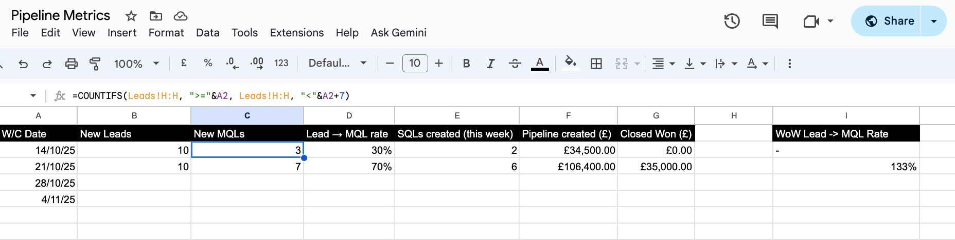
Add a simple Pivot table for MQLs by utm_source and by utm_campaign.
Why:
You’ll see the core numbers at a glance without going into your CRM. Pivot tables allow you to view “by channel” and “by campaign”.
Feeling Lazy or Lost?
Connect with me on linkedin and DM me. I’ll send you the complete sheet.
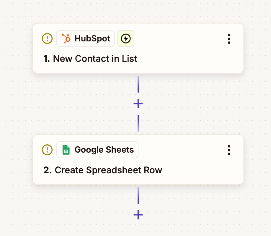
5. Set up a weekly summary
Create a new zap in Zapier
Follow these instructions:
Add new step: Schedule
Trigger event for every week
Choose day of the week and time of day e.g. Monday 7am
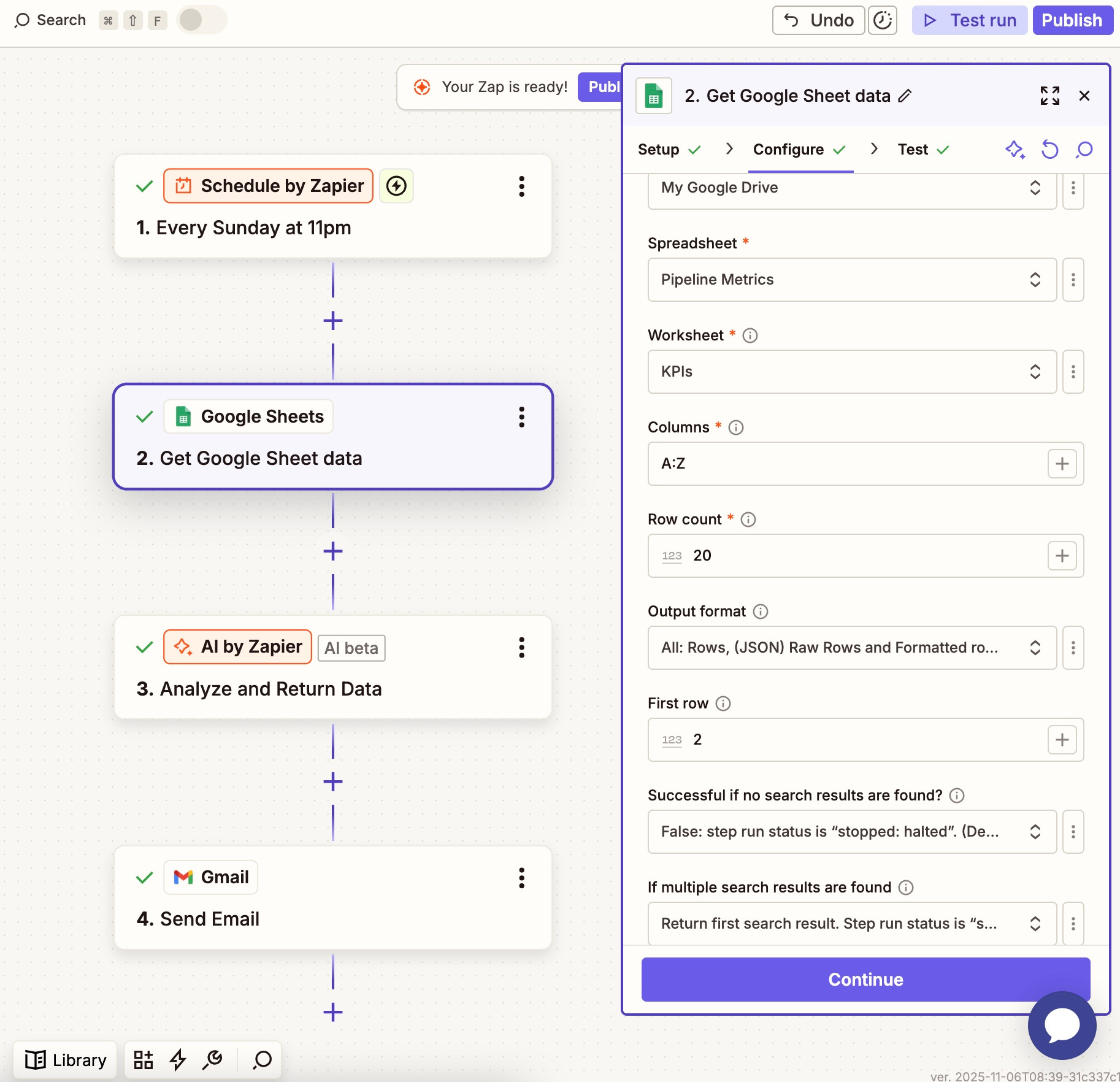
Add new step: Google Sheets
Fill out the necessary fields (as per image)
Choose the correct worksheet depending on what you want to summarise.
You can only summarise one worksheet per zap so you may want to duplicate this zap at the end if you want summaries of Leads, Deals and Traffic for example.
Make sure to include all rows in ‘row count’

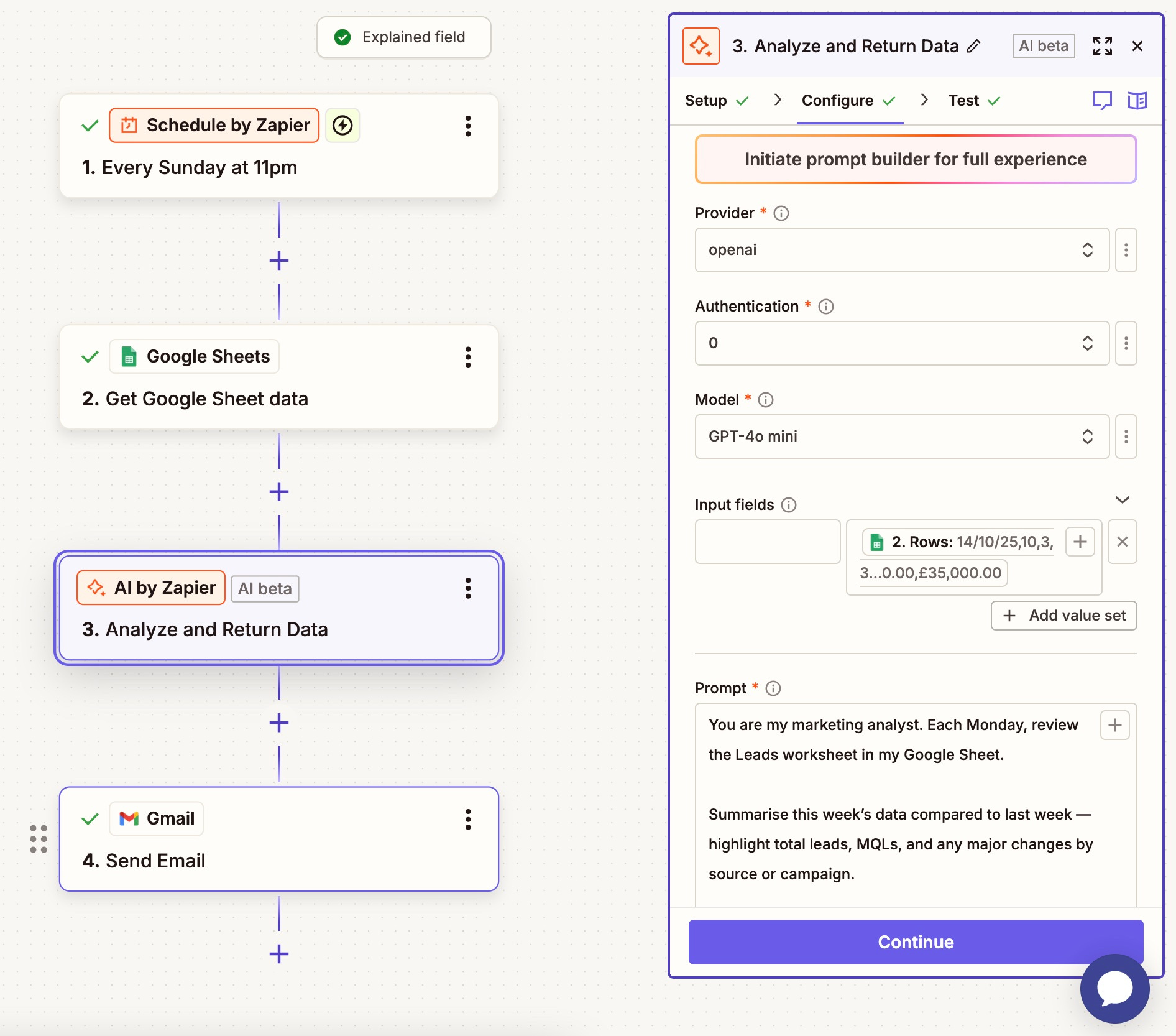
Add step: Run AI
If you have access to the OpenAI API (an extra cost but very cost efficient), you can select ChatGPT here. If not, use AI by Zapier and select your preferred LLM
In input fields, the left hand field is for static data, the right is for dynamic data. We want to use dynamic data so we get fresh results based on the sheet rows.
Click the + and select “get google sheet data” and then 2. Rows. This will provide the LLM with all the row data from the worksheet.
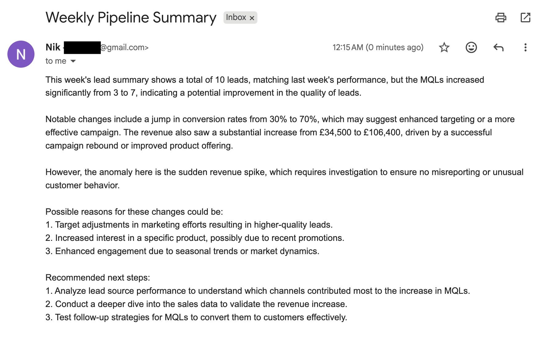
Add your prompt:
”You are my marketing analyst. Each Monday, review the Leads worksheet in my Google Sheet.Summarise this week’s data compared to last week — highlight total leads, MQLs, and any major changes by source or campaign.Call out any unusual movements or anomalies (big spikes, drops, or new channels appearing).Suggest 2–3 possible reasons why these changes happened, based on the data patterns.Recommend 3 specific next steps or actions to investigate or test this week.Keep it concise and clear — 200 words max.”Add your MQL and Funnel Rules doc (from Step 1) into the knowledge base field
Leave output fields blank and ‘return as an array of objects’ as false
Run Test

Add step: Gmail / Slack
I’ve chosen Gmail here as I don’t have a personal slack account but this step is fairly self explanatory
Connect your Gmail or slack account and add the ‘to’ and ‘from’ addresses
In the ‘body’ field, add the dynamic content that was returned in your last step labelled ‘output’ (NOT step output).

Save and publish
Duplicate this Zap for Deals etc.
Change the worksheet inside the google sheets step
Change the prompt if necessary
Congratulations you’re an automation wizard and also 5 steps ahead of most at 7am on a Monday.
NB: If you can’t use Zapier
You can do this manually by creating a project in ChatGPT named Weekly Pipeline WIP and manually upload the .xlsx sheet in and then run your prompt. It’s just a little less fun.
6. Set the weekly “always-on” insight
Duplicate the above zap changing two things:
Change the worksheet inside the google sheets step
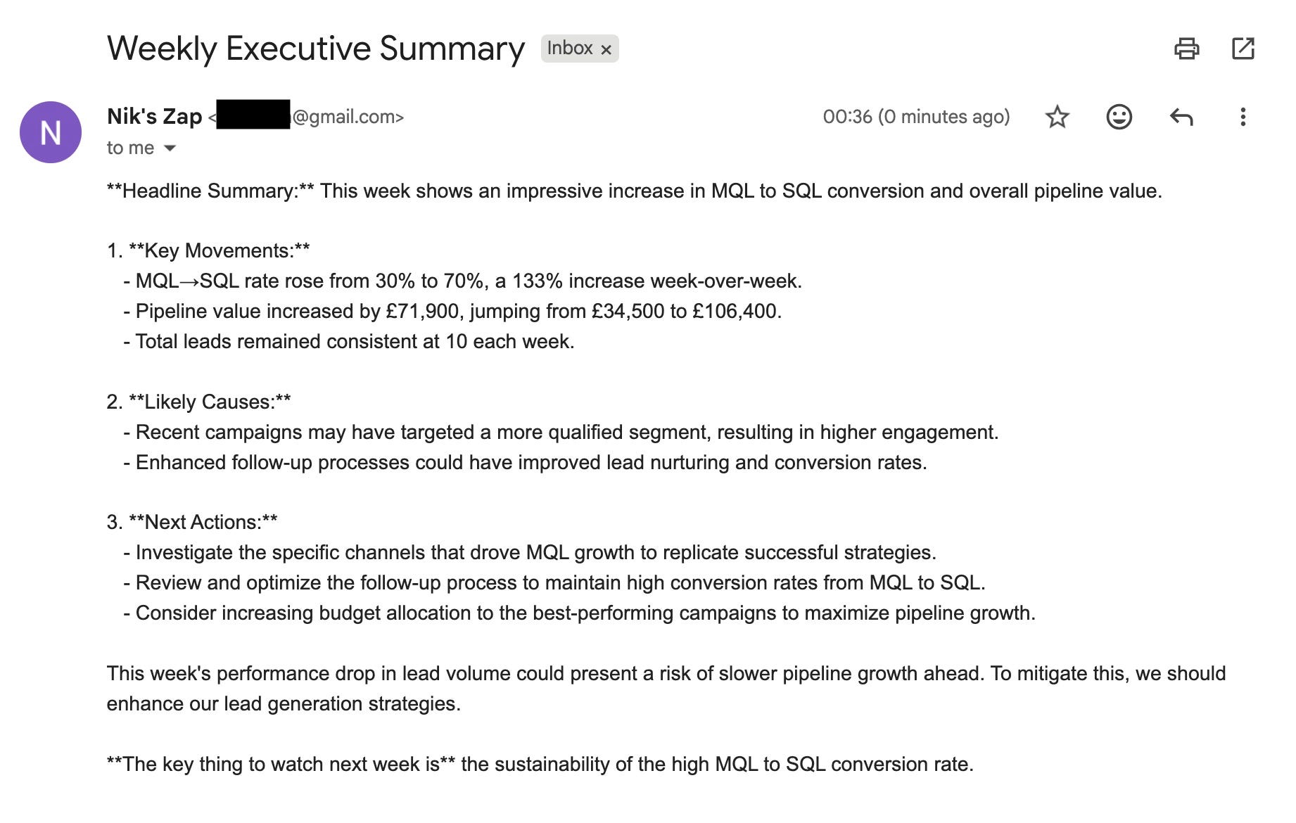
Change the prompt to the one below in the AI step. This prompt is geared towards having deep insights and actionable next steps for senior leadership.
You are my marketing analyst. Review the KPIs tab in my Pipeline & MQL Master Sheet and summarise the latest week’s performance.

Compare this week to the previous week. Focus on trends that matter for growth and pipeline health.

Include:

Headline summary: a short overview of overall performance (one sentence).

Three key movements: e.g., Leads, MQL→SQL rate, Pipeline £, Win Rate. Include percentage or value change week-over-week.

Two likely causes: offer clear, data-based hypotheses for what’s driving those changes (campaigns, channels, timing, etc).

Three next actions: concrete recommendations — what we should fix, double down on, or investigate next week.

If performance dropped, add one line on what risk it creates and how to mitigate it.

Keep it under 200 words. Write it in a clear, executive-ready tone (like a Slack update I could post for my CMO and senior leadership). Avoid jargon. End with one short takeaway line: “The key thing to watch next week is…"
Change the subject line in the Gmail step
Run this as usual, post the output to Slack (#weekly-pipeline) or email it to yourself (or straight to leadership if you’re feeling brave!)

7. Add two simple alerts (optional)
In your KPIs tab, calculate WoW Lead→MQL rate change using this formula: =([This week rate] - [Last week rate]) / [Last week rate]
Set conditional formatting:
Red if ≤ −0.20, green if ≥ +0.20.
Optional: set an alert in Slack or email if “RED KPI” appears.
Why:
You’ll catch drops or spikes before they become surprises.
8. Present to execs in 5 bullets
Ask ChatGPT:
“Turn the weekly summary into 5 bullets for senior leadership. Keep one number per bullet, then add one ‘so what does this mean?’ line.”
Why:
Your CMO doesn’t have the time for data dumps, just give them the headline, the number, and what you’ll do next.
You’ll know you’ve succeeded when you have:
One Sheet everyone trusts.
A single page of rules for MQL and stages.
A weekly Slack post with the same sections each time.
Two alerts that catch big drops or spikes.
Three actions in every update.
Final thoughts
AI hasn’t made me love data overnight, but it’s made me much more capable.
The unexpected benefit is that it actually taught me a lot about reading data just by doing.
You’ll spend less time copying from dashboards and more time thinking about what the data means.
And that’s the real job: marrying the numbers to the why.
If you’ve ever felt like a bit of a spanner with data, you’re not alone. The good news is, spanners are pretty effective tools when you use them right.
See you next time!
Nik
The Zapier to ChatGPT intgration is a game changer for pulling insights from Salesforce data. I've ben manually exporting CSVs every week and this automated aproach would save so much time. The pivot table setup for MQLs by utm_source is exactly what I need.
This is what real ops for PMMs looks like: systems that scale, not dashboards that drain. You fixed the insight loop.👏